RETOOLED AND READY TO GO
By Thomas Connors
PHOTOGRAPHY BY DUSTIN HALLECK
STYLING BY CATE RAGEN
Sunroom
By Thomas Connors
PHOTOGRAPHY BY DUSTIN HALLECK
STYLING BY CATE RAGEN
Sunroom
Time never stands still. And for many of us, space isn’t a constant either. The closet under the stairs becomes a powder room. That unused attic? Meet the man cave. And now that you’ve walked your daughter down the aisle, wouldn’t her old room make a perfect office? Unless we up and move with every change in life, our homes—with a little nudging—grow with us.
When a couple with two young boys decided their Highland Park home needed an update, they turned to Elizabeth Mollen of Chicago-based Stone Textile Studio. The layout of their 1940s house didn’t offer the flow they were after, but with some sympathetic tweaking the interiors became more conducive to the family’s active, relaxed lifestyle. “We retooled the space to create an open plan, making the kitchen and family room more connected,” says Mollen, who began her career in textiles before expanding into interior design. She also carved out some space from the kitchen to fashion a much-needed mudroom and transformed the basement from four hard-to-use rooms into one big space that functions as a media center and playroom.

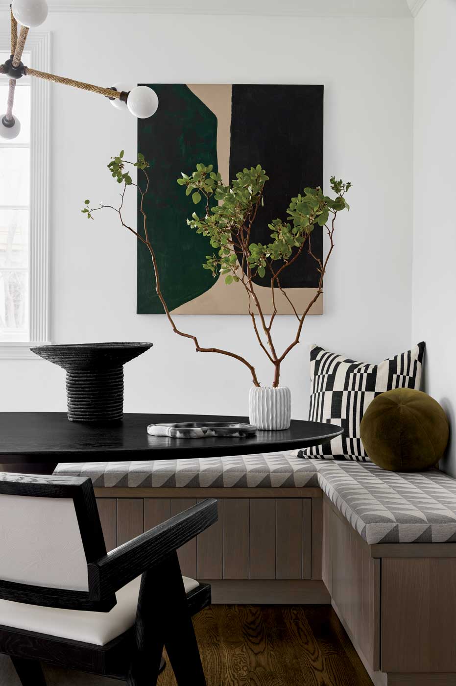
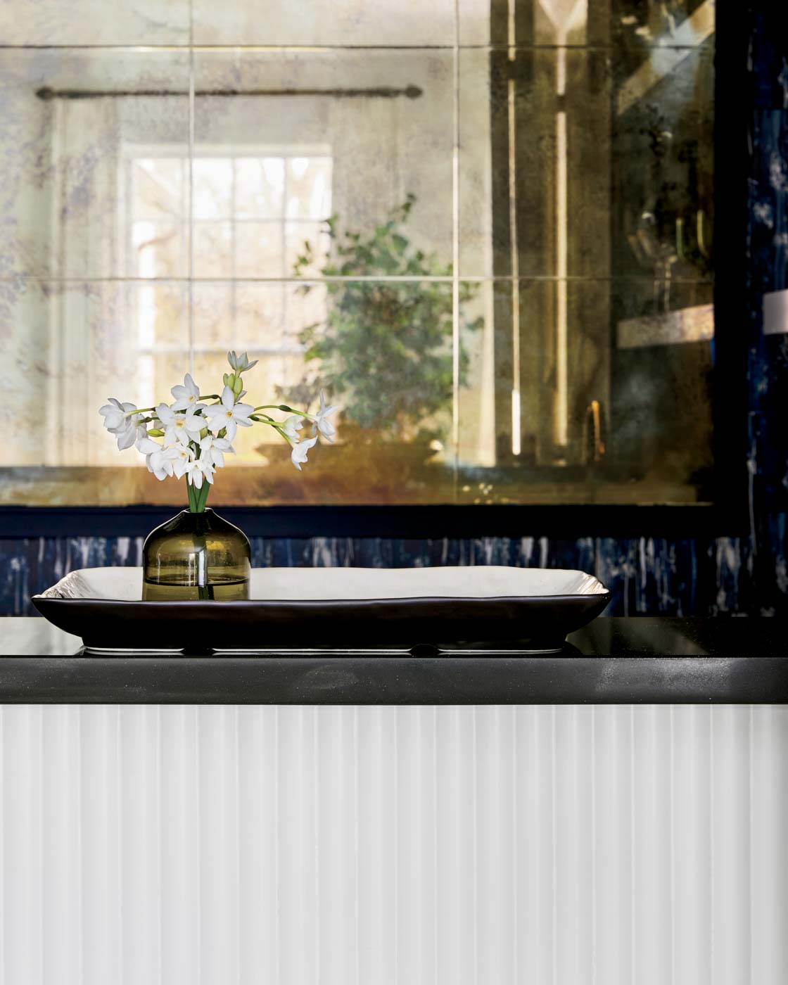
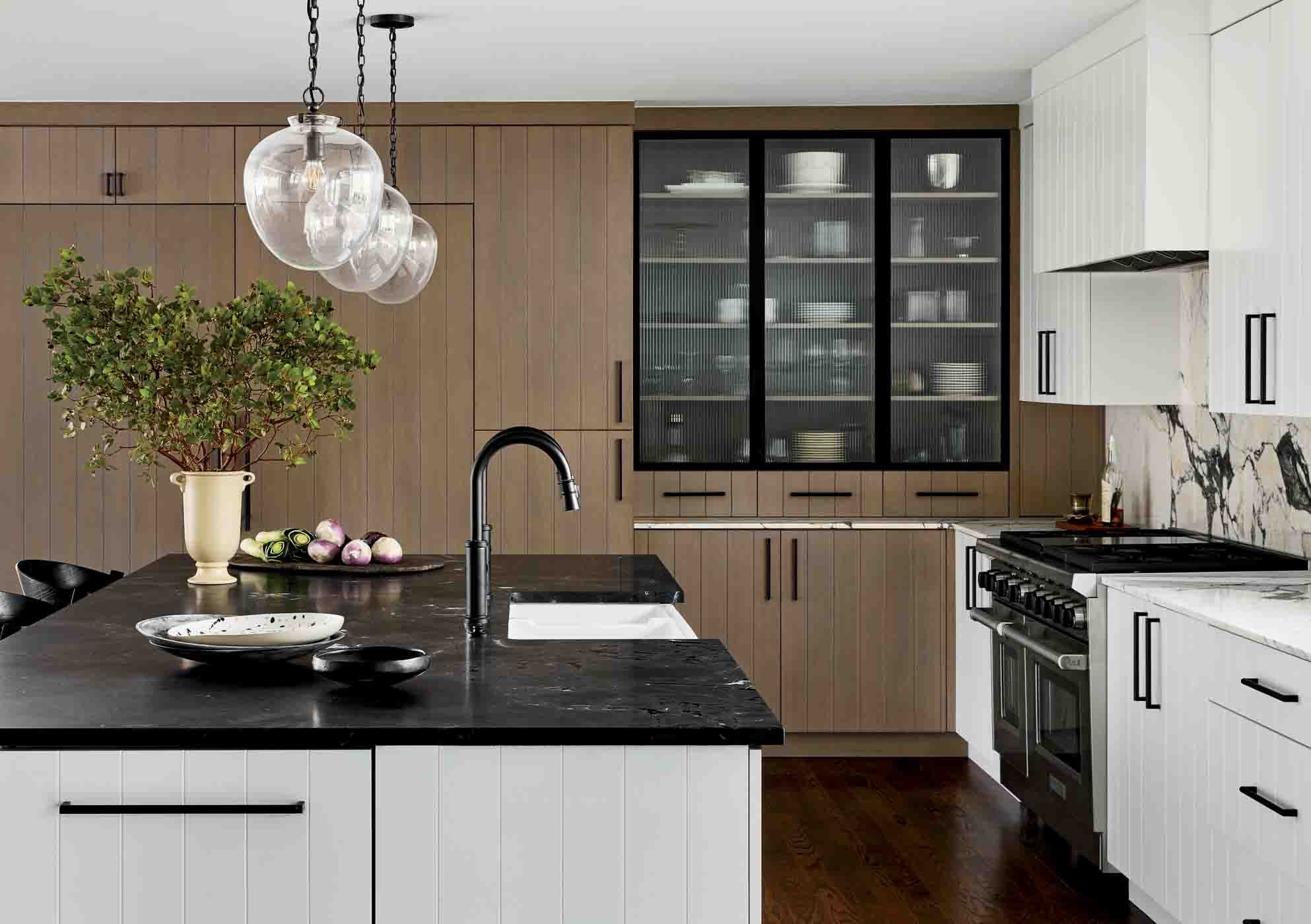
Good looks and functionality drove the kitchen design in equal measure. “Our clients are avid cooks and love entertaining, so a large durable island with a huge sink was key,” says Mollen. “The sink faces the family room so everyone can be in one place during the crazy dinner time rush.” Mollen topped the island with a durable black quartzite and outfitted the space with custom shiplap cabinetry. A custom, L-shaped banquette and a table from RH form a comfortable, sunlit seating area. Throughout, a palette of white and taupe/gray gives the kitchen a crisp yet warm air.
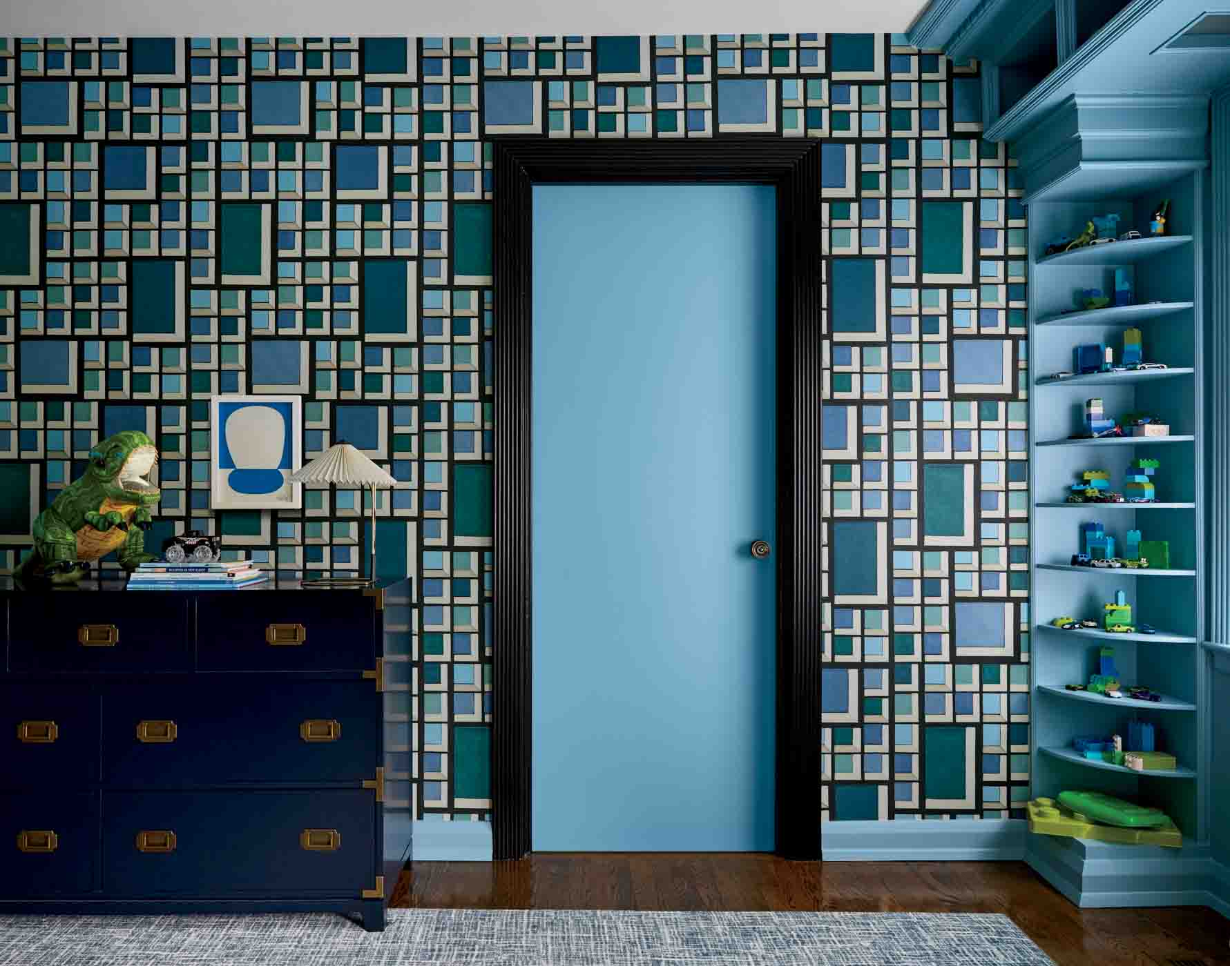
Black, white, and earth tones pervade the home, punctuated with eye-popping bold strokes of pattern and color. A fanciful lama wallpaper brightens the laundry room, while a green snakeskin wallpaper by Phillip Jeffries gives the dining room just the right touch of formality. The children’s bedrooms are awash in beautiful blue wall coverings from Kelly Wearstler.
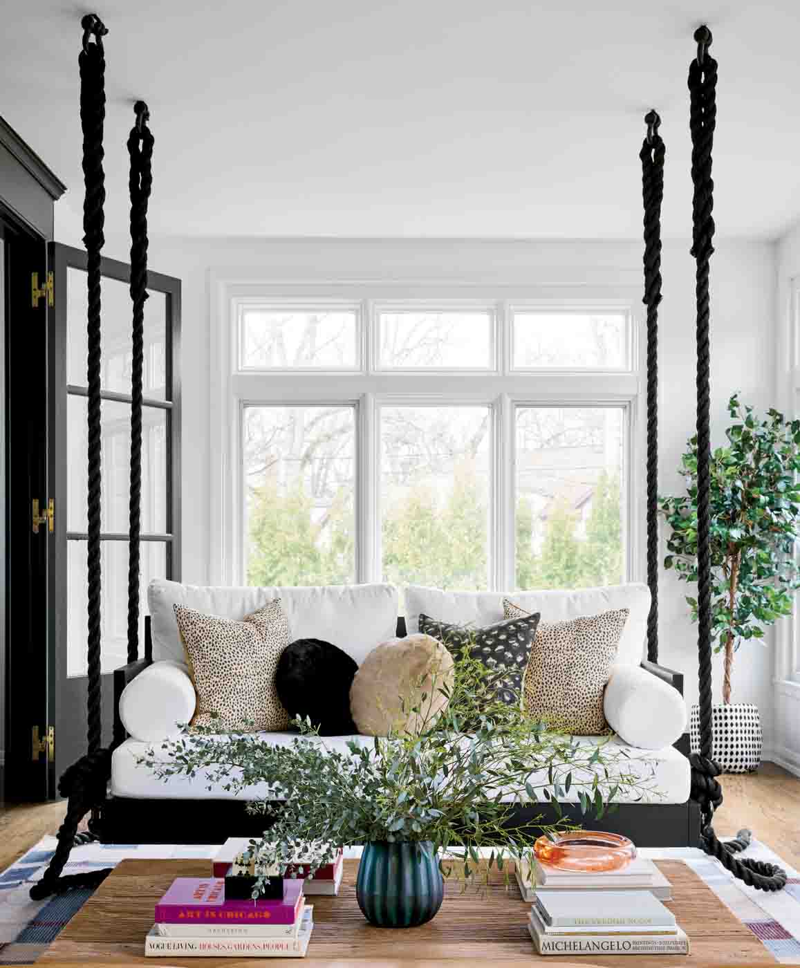
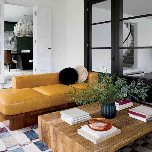
Lighting gets special attention in spaces, from the almost sea creature-like pendant over the custom dining table to the marvelously sculptural vintage piece that stands in the curve of the entry hall staircase. The remarkably elevated sunroom sports an upholstered bench from CB2 with a vaguely Art Deco base and a wonderfully at-ease sofa that swings from the ceiling. Altogether, this re-envisioned home is a pleasing balance of high style and livability, the classic millwork and contemporary lines of the furnishings creating a substantive but far from stuffy ambiance.
“These were fun clients who really appreciate design and the creativity process,” says Mollen. “They came with some general ideas, but let me help them explore possibilities and were open to new ideas. They wanted to have fun while keeping the design timeless with pieces they will love forever. They were open to taking design risks, which is every designer’s dream.”
For more information, visit stonetextilestudio.com.
Sign Up for the JWC Media Email