LET THE MAGIC BEGIN
By Elaine Doremus
Photo courtesy of Ryan McDonald Architecture + Interiors Photography
The Living Room.
By Elaine Doremus
Photo courtesy of Ryan McDonald Architecture + Interiors Photography
The Living Room.

Designers selected to help transform a midcentury home and its lavish gardens for this year’s 19th biennial Lake Forest Showhouse & Gardens were asked to reimagine the estate’s indoor and outdoor spaces in new and inventive ways.
A recent preview of this spectacular Showhouse endeavor revealed that they more than exceeded expectations. This year’s designers have truly made their mark, thinking outside the box to transform this midcentury home with Georgian sensibilities into a true work of creative genius.
Expect to see a return of glistening lacquer in bold, interesting colors and long drapes trimmed with hand-embroidery; feminine scalloped edges that surprise and add a touch of midcentury glamour; built-in banquettes from the library to the dressing rooms and kitchens, which make efficient use of space; and an artful mixing of the old with the new to usher in a new era in design.
The adventure begins the moment you walk into a soaring foyer with a floating staircase designed by Sarah Vaile Design. The walls are swathed in DeGournay’s hand-stitched silk and linen appliqued Matisse-inspired “Jazz” mural, with figures that seem to dance up the stairs to the second story. The grand foyer delivers a recurring theme throughout the home: “expect the unexpected.”
As you roam from one room to the next, you will delight in surprises at every turn. On the main floor, the expansive living room (Vincere Ltd), shifts to a meditation on luxury and comfort. Upon entering the adjoining library (Joey Leicht Design), you will be met with a moody, sleek, and somewhat seductive vibe with its matte black paneling, and avant garde furnishings and accents.
In the newly expanded and restructured two-zone kitchen (Ablaze Design Group), you will envy the high-end gourmet prep and cooking area and find inspiration in the European furnishings and accessories in the living and dining portion (Patina Collection Design Group). Upstairs, you will appreciate the globally inspired whimsy in the eclectic Guest Powder and Dressing Room designed by Erin Minckley for Relativity Textiles.
Moving out to the East Cottage, Lori Lennon & Associates has masterfully designed the compact kitchen with an eye to functionality and maximizing space, using a stunning black and gold range to set the tone for the room. Also in the cottage, Lauren Collander Interiors created a shimmering sanctuary in the Primary Bedroom, with its striking custom dressing vanity and closet, and adjoining lounge space.
The artful blend of antique, modern, and eclectic pieces and sensibilities is a hallmark of a Showhouse you won’t want to miss. Here is a sneak peek.
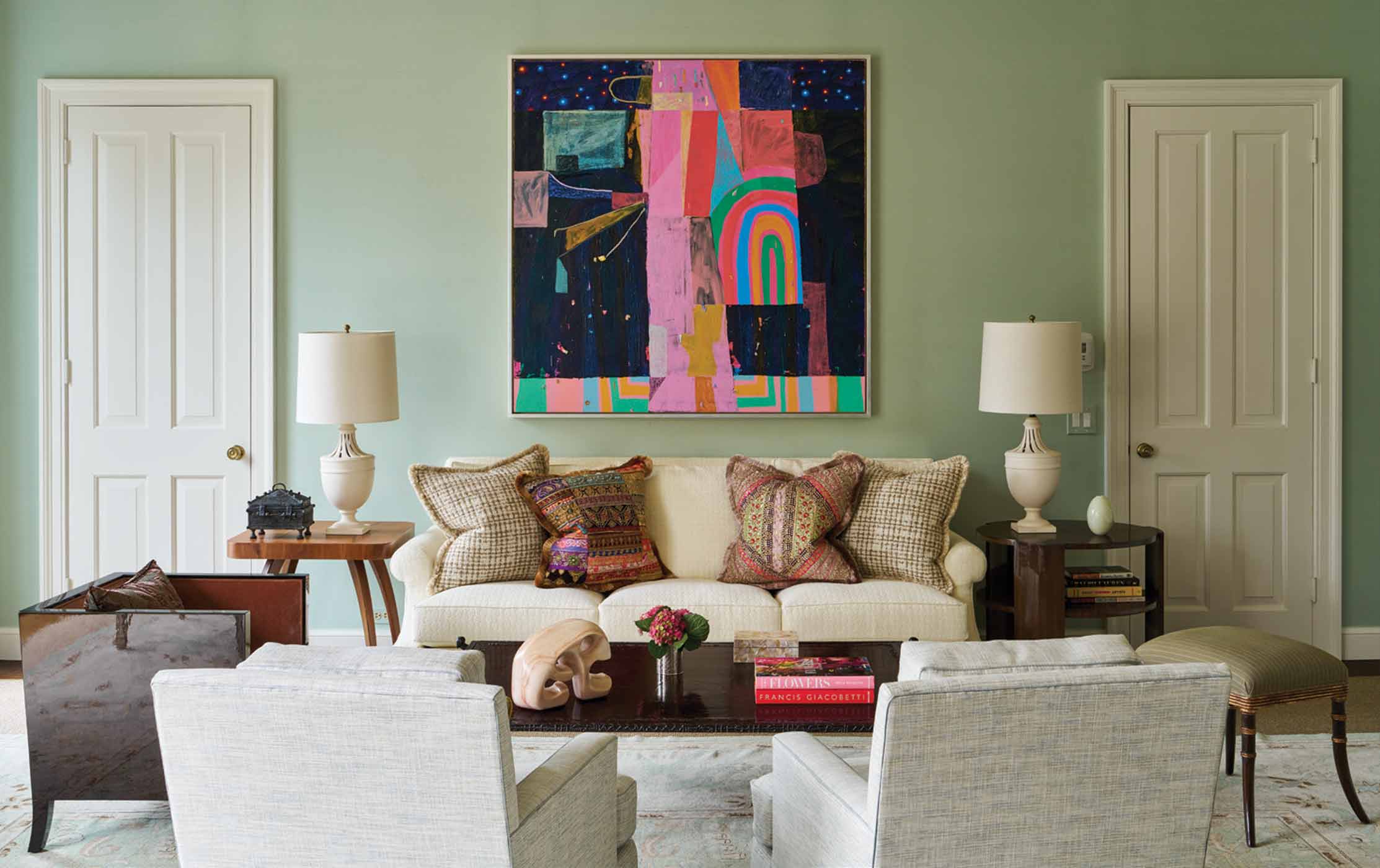
Vincere Ltd., vincereltd.com
“We feel very fortunate to be designing the living room, which is grand in scale and reflects Georgian symmetry,” says Tom Konopiots, co-principal and partner with Michael Stornello of Vincere Ltd.
It was no small feat to design the nearly 800-square foot room in a way that invites cozy, intimate gatherings while also accommodating larger-scale cocktail parties. So, they started with the rug, or at least that’s how the process unfolded for this design duo.
While in Los Angeles, they went into Ariana Rugs, a vendor that is represented by Lapchi of Chicago.
“We explained we had a very large room and we fell in love with the second rug they showed us,” says Stornello. With its European design, the 18 x 28-foot rug with its 225 knots-per-inch that took three years to create became their inspiration point from which to anchor the array of heirloom quality pieces and art. They added de Gournay slub silk wallpaper with a subtle shimmer to create, a “pretty envelope to work from.”
From there, says Stornello, “we imagined how the room would be used, choosing to add a center table, baby grand piano, and two seating areas.” Above the solid dark wood center table hangs a stunning Garbo opaque Venetian glass chandelier by Fortune.
When it came to selecting furniture pieces, Stornello and Konopiots sourced limited edition, collectible pieces representing artists from around the globe and art from galleries they’ve vetted in their design work.
“We are very excited about the very special sculptured bronze and lacquered coffee table designed by French artist Ingrid Donat,” says Stornello.
“As well as the hand-embroidered fourpanel screen placed on a gorgeous wool sateen from de Gournay, which is mounted on a wall bracket,” Konopiots adds.
An Aegean blue reproduction chinoiserie filigree cabinet between two of the windows is a piece of art in itself. The custom marble fireplace surround created by Paris Ceramics is flanked by reproduction Italian chests while a pair of Grace Munakata paintings from Anne Loucks Gallery float above. This is just a taste of the notable art and accent pieces that adorn the room.
Elegant cream colored custom embroidered wool curtains by Holland and Sherry add texture and depth, while framing the expansive windows that look out to the lawn terrace. To style this outdoor lounge and seating area, Stornello and Konopiots worked with Brown Jordan to bring in a selection of outdoor furniture, and Finnegan Gallery to source antique pieces, including large urns on pedestals.
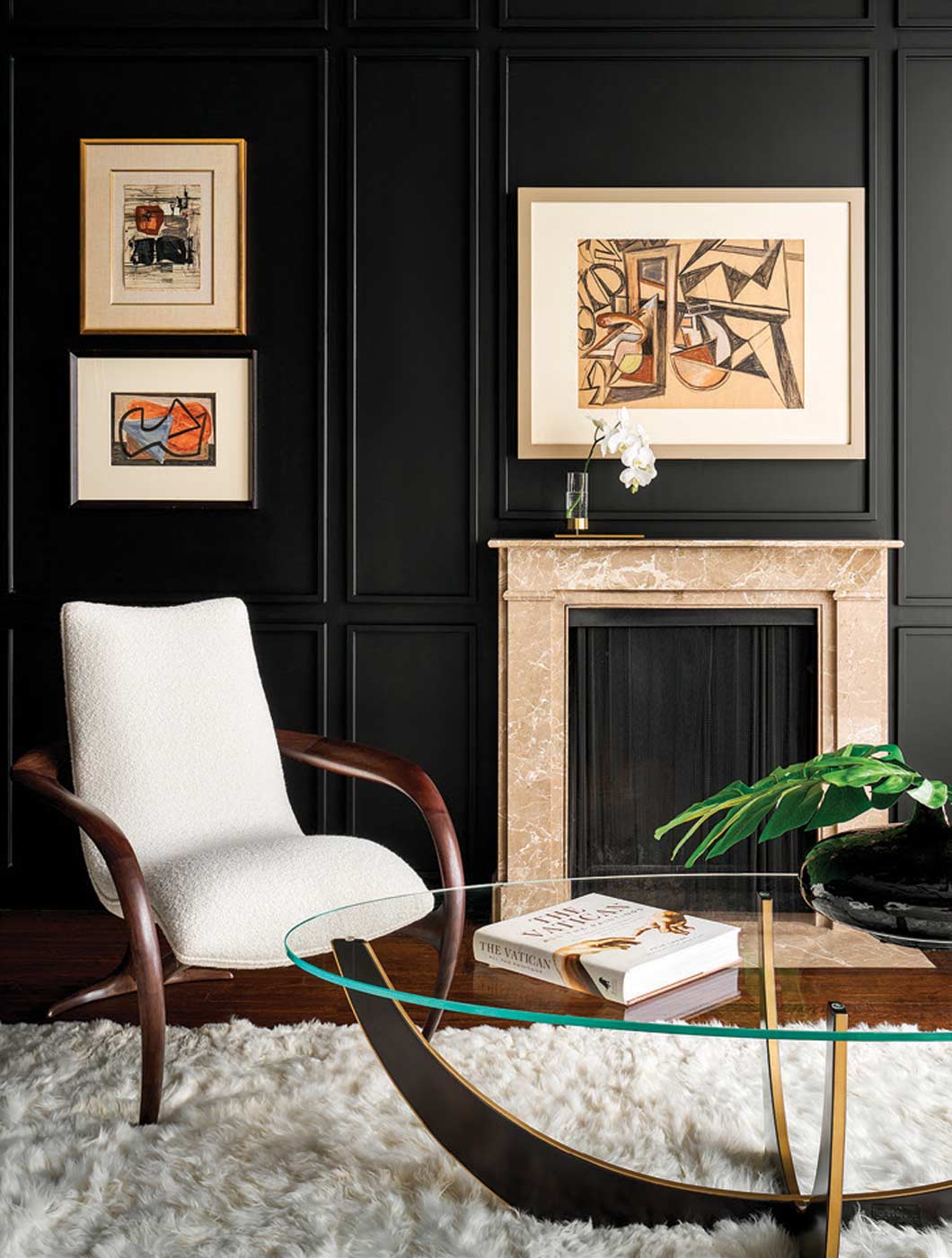
Joey Leicht Design, joeyleicht.com
Interior designer Joey Leicht has transformed what was once a conservative cherry-paneled library into a moody, elegant, and sophisticated “intellectual space.” He set the stage by covering all of the formerly cherry wood with a rich and elegant black matte lacquer, called Black Beauty.
“The library was one of my top two choices,” Leicht says. “When I walked into the space, I fell in love with it and almost pictured it finished.”
Easier said than done, as it set him on a mission to find the particular pieces to complete his vision, from the furniture to the art to the lighting and accessory pieces.
“The furniture is reminiscent of the 1940s, very architectural, and very comfortable,” he says. Some of the furniture was custom made for this room, including a dramatic cream and dark wood, curvilinear Vladimir Kagan chair, and an upholstered banquette built into what was formerly a section of the bookshelves.
One particular piece of art he is excited about is the dramatic black and white Franz Kline-inspired canvas mural that covers the ceiling. Kline was an American painter associated with the Abstract Expressionist movement of the 1940s and 50s. Leicht was inspired to create this faux-finish piece after seeing a Kline on exhibit at The Whitney Museum in New York City.
He added French modern art throughout the space with the dramatic black matte wood as the backdrop. Additional finishing details include his own custom-designed tape trim on the floor length drapes by Brimar.
Be sure to look for the many unique accent pieces Leicht selected and nestled among the bookshelves—a large acrylic chess piece filled with vintage watch parts; delightful pop-out Hermes books—in addition to modern sculptural lighting.
This is Leicht’s fourth consecutive Lake Forest Showhouse, which has included a fabulous Young Man Cave Bed and Bath, a Young Adult Lounge, and The Girl’s Bed and Bath.
“I love designing beautiful spaces and bringing smiles to people’s faces,” he adds. I give it my all, and my heart is in every decision I make, especially for this very important cause. I also give credit to all of the behind the sense tradespeople who make this possible.”
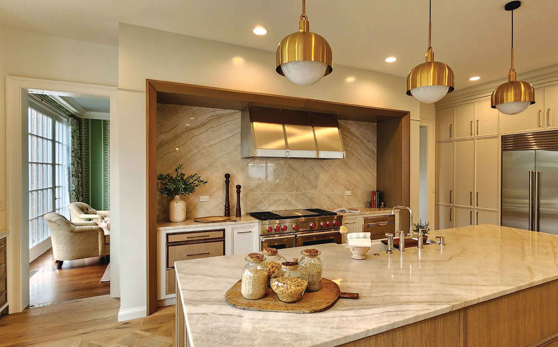
Ablaze Design Group, ablazedesigngroup.com
Designing and building out the enormous, open-concept kitchen in the main house involved combining four rooms, removing a fireplace, adding massive floor-to-ceiling windows and doors to the outside wall, and enlisting two designers to work on two segments of the multi-purpose kitchen.
George Markoutsas, CEO of Ablaze Design Group, was more than up for the challenge.
As the contractor responsible for much of the remolding required for Lake Forest Showhouse productions since 2015 (he has worked with the Showhouse team in different capacities since 2008), he brings his deep knowledge of design/build to the table. His appreciation for natural elements, such as the large-profile honey white oak parquet wood flooring by Divine Flooring, solid white oak cabinetry, and creative mixed metal workings adds to the European feel of the kitchen.
Markoutsas says the Georgian style of the home inspired his design approach.
“It’s a 1970s home, built like a 1920s home, with a midcentury vibe,” he explains.
So, he played off of that midcentury modern, solid, and stately aesthetic in his choices. The custom range hood was designed to mimic the exterior surround of the back of the home, with a large flyover to make the range wall a focal point.
“Overall, we wanted to create a well-balanced space that emphasizes the concept of a lifestyle kitchen, where form and function unite seamlessly,” he says. The highly functional kitchen features ample storage with mindful placement of custom cabinetry by Plain and Fancy, that’s further distinguished by its well thought out interior storage features.
Ample countertop space, topped with natural stone quartzite by Caesarstone, and state-of-the-art appliances by Wolf and SubZero, make this is a gourmet cook’s dream. Metal accents throughout the kitchen, including lighting and electric by Buster + Punch add visual interest.
In addition to the working area of the kitchen, Markoutsas took on the Primary Bathroom. With budget constraints in mind, he made the most of the high vaulted ceilings with an emphasis on the elegant natural marble that takes center stage.
“The design features mindfully tucked-away compartments that provide privacy and functionality, while accentuating the central area with its striking vaulted ceilings,” he says. “We’re very excited about the layout of this space, which is both functional and visually stunning. We’re also proud to have partnered with Renaissance Tile and Bath, who provided us with some truly exquisite materials and finishes that elevate the overall look and feel of the room.”

Patina Collection Design Team, patinacollection.com
Owner and curator Karen Ann Abell, and creative director Jay Fisher of the Patina Collection Design Team were thrilled to take on the challenge of furnishing and accessorizing the living, dining, and outdoor terrace space of the newly expanded large kitchen.
As first-time designers to the Lake Forest Showhouse, Abell and Fisher bring the additional experience and talent to the table of owning and running a retail home and design store in Naples, Florida.
“This kitchen was a fairly challenging space, but our store is also a challenge,” Fisher says. “It’s two stories with a very high ceiling, and we are always staging and moving things around. It’s in our wheelhouse to come in and transform a space.”
Add to that their ability to source unique items directly from Europe and their own store, and you get the end result: Abell calls it “European decorating from the soul.” Think Italian pottery, bold antique pieces, topiaries, French baskets, and beautiful patterned fabrics.
The large and airy kitchen was reconfigured by Ablaze Design Group by combining four rooms, removing a fireplace, and adding a whole wall of floor-to-ceiling windows and doors where there once was a brick wall.
“Because of the large space, we created cozy living spaces around the kitchen,” explains Abell. In front of one window, they placed a café table and chairs. In the center of the open area, they’ve installed a long wooden farmhouse buffet table, which contrasts nicely to the gourmet working part of the kitchen with its modern appliances and fixtures.
In addition to the living area of the kitchen, Abell and Fisher designed both the kitchen terrace and the terrace off of the nearby dining room.
“With the addition of the new windows and doors, there is an amazing amount of light and it opens up the kitchen to the outdoor space,” says Fisher. “We are excited to have both spaces as they speak to one another, and we wanted the kitchen to have a garden feel to it—bringing the kitchen out and the garden in.”
The team partnered with Bunny Williams Home to design the nearby dining room terrace, which features a European-inspired kitchen cutting garden with a marble topped planting table.
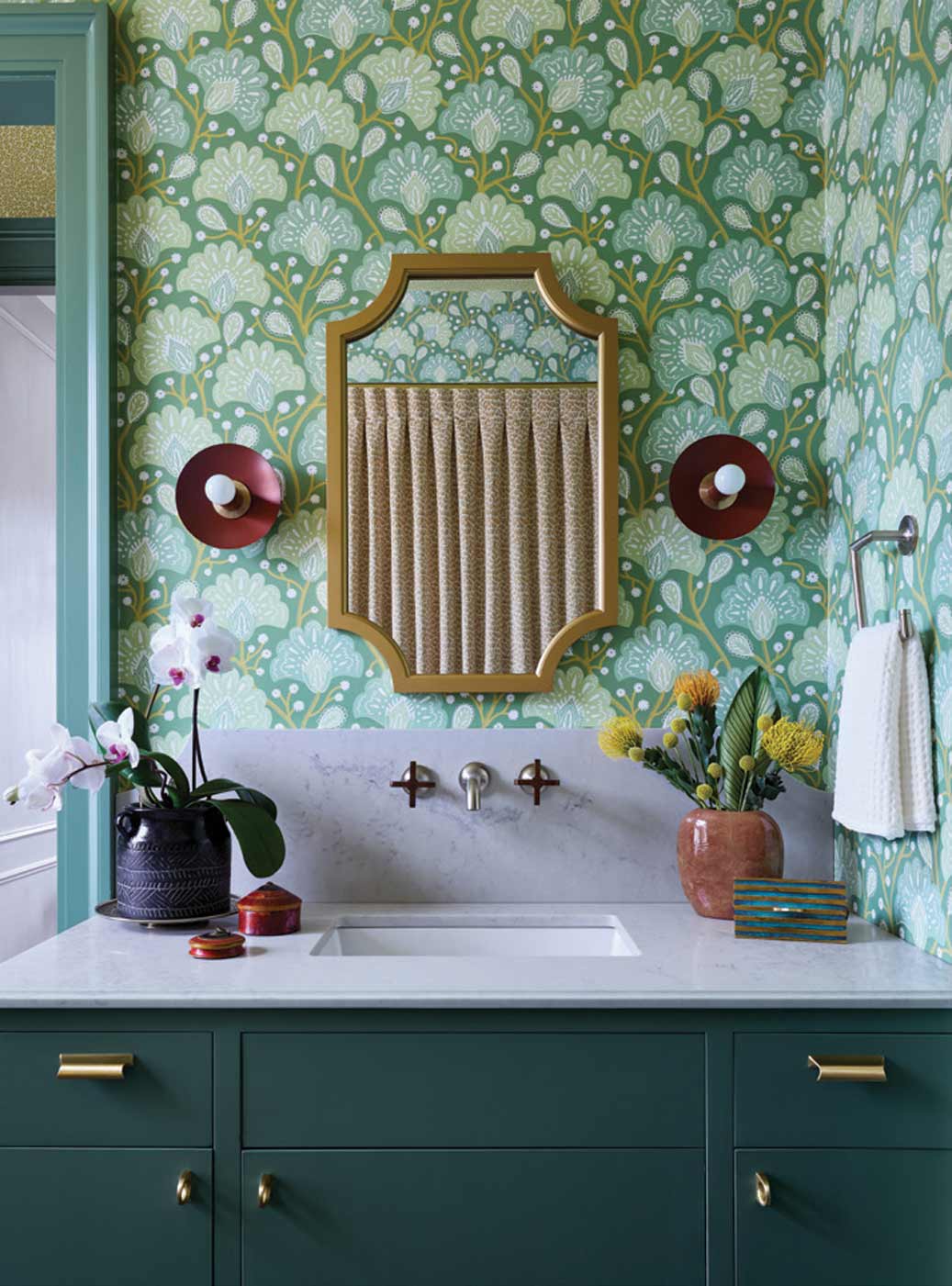
Relativity Textiles, relativitytextiles.com
“People can expect my space to feel warm and inviting, a bold take on traditional,” says Erin Minckley, founder and owner of Relativity Textiles. Her company designs and manufactures unique and custom designed wallpapers and fabrics.
Inspired by her travels around the world, she says that a recent trip to the Yucatan peninsula of Mexico influenced the room at the Showhouse. Mérida’s eclectic colors, patterned floor tiles, and bold art inspired her to break from normal conventions in design. To transform the vintage powder room, with its challenging adjoining dressing area and closet, Minckley envisioned creating a sanctuary for the homeowner, filled with plants in the tub—an oasis amidst everyday life.
In the dressing area, off the main hall, she removed the closet door to open up the space, creating a vibrant mustard colored alcove where she installed a large painting by artist Megan Borah. The walls adjacent to the art pull a floral pattern design directly from the art—the custom wallpaper was made just for this space.
In each of the three spaces, Minckley used wallcoverings she printed in her Chicago studio, designed by the artists of Relativity Collective. The walls of the dressing room are adorned with her colorful chameleon botanical print, which is paired with a bold black and white geometric pattern on the ceiling by Stone Textile Studio.
“I chose some atypical color combinations, because I believe in living with vibrant and happy colors in Chicago’s gray climate,” she says.
The bathroom is wrapped in hues of green “Palm Flower” wallpaper, inspired by African textiles and designed herself for her fourth collection. The shower curtain features another of Relativity Textiles own globally eclectic patterns, Gaar Gold, and on the ceiling yet another wallpaper by SydMayme. The vastly different patterns and colors of the wallcoverings, shower curtain, and fabrics all serve to complement one another, rather than compete, and invite the eye to all areas of the unique space.
Originally wanting to replace the 1960s linoleum tile with cement tile from Mexico, Minckley realized that it would require too much reengineering. Her solution was to paint both the linoleum and the neighboring wood floor, and all of the trim in both areas, in Benjamin Moore’s Mediterranean Teal. It’s bold yet soothing, and serves to integrate the powder room, dressing area, and alcove. A red hand-painted border around the floor adds another element of visual interest to the room.
“Globally inspired design means transcending our geographic location and pulling in stories from around the world,” Minckley says. “This home’s guest powder room allows you to stamp your design passport on several pages.”
Lori Lennon + Associates, lorilennon.com
Having participated in more than 70 showhouses around the country, including the Lake Forest Showhouse & Gardens, interior designer Lori Lennon believes that the psychology of a space must be right if the design is to work.
“I study every aspect of design and the psychology of designing any space rather than follow the trends,” she says. “The kitchen always has to be logical and meet the needs of the client before I get into the aesthetics, such as what colors make them happy and the lighting that is so important.”
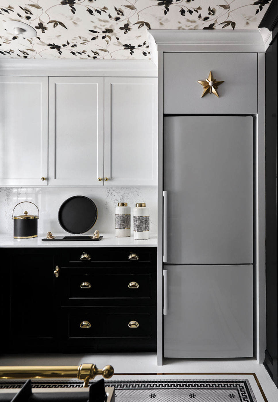
In designing the “little kitchen” in the guest cottage, Lennon wanted people to get a sense of an organized kitchen. “It’s very important to balance the room,” she adds.
This proved to be a bit of a challenge given the small space and the fact that the window wall is off center. But she tapped into her many years of design experience, flanking the off-center window with matching 12-inch-tall cabinets, as well as designing the base cabinets below with panel fronts to create a bit of an illusion of symmetry.
After selecting a black and gold Hallman Industries professional range with five brass Italian burners, Lennon incorporated that same theme around the lower cabinets. “It looks like the range is continuing around the kitchen,” she explains. The upper cabinets are white, as is the white porcelain refrigerator that appears to run to the ceiling thanks to more clever cabinetry woodwork. The black and white contrast throughout adds to the symmetry of the room.
Despite its small footprint, Lennon embraced the additional challenge of utilizing all of the space she could get. “I found products that can access the corner cabinets, with pull outs on each side of the kitchen that have access to the blind corner. On the upper cabinets, she added small baskets that pull out to access small corners.
Lennon has learned over the years that the only way you can achieve a wonderful kitchen is with custom cabinets and the right lighting, which she calls “mood lighting.”
In this case, utilizing natural sunlight and putting additional sunlight into the kitchen with the correct lighting makes all the difference. As do the extra touches she’s added, including a gold star above the refrigerator to give it a little glamour and the wallpapered ceiling in blacks and grays with hints of subtle metallic gold.
“It isn’t distracting but rolls around and encompasses you as your work in the kitchen,” she says.
This is truly a small but mighty gem of a kitchen in the darling East Guest Cottage.
Lauren Collander Interiors, laurencollanderinteriors.com
The timing for Lauren Collander Interiors’ debut in the Lake Forest Showhouse, which coincides with the opening of a new design studio in Lake Forest, couldn’t be more perfect.
With a decade of experience in both boutique hotel design around the world and in residential design, it is only fitting that Collander designed the primary bedroom— a tranquil sanctuary—in the East Guest Cottage.
“The idea that this cottage is intended for the homeowner’s most cherished guests was an inspiration for our design choices,” Collander says. “We wanted to create a luxurious and memorable experience to live your best life, so we focused on thoughtful details that provide everything a guest needs to feel special.”
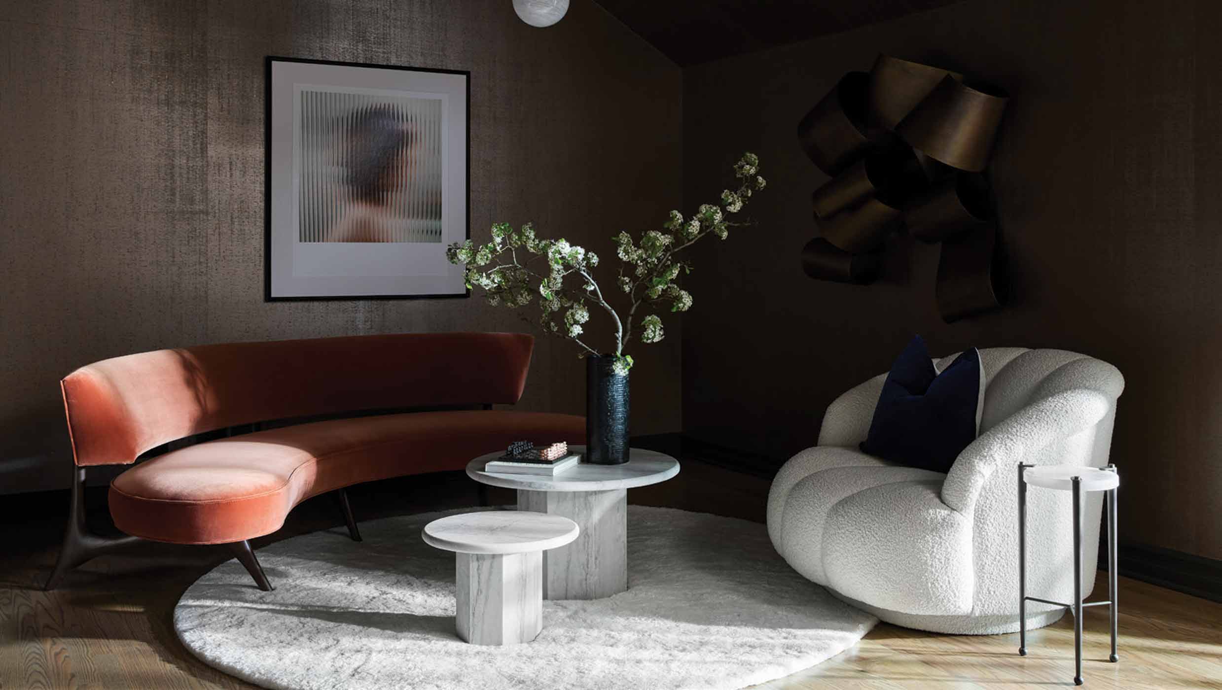
And that it does. When you enter the bedroom room, you are enveloped in the shimmering bronze cork wallcovering by Phillip Jeffries, which covers the walls and ceiling that follows the angled roofline. The cozy, inviting, and serene atmosphere offers surprises around every turn with an inviting bed and sleeping area—set apart as it sits atop a gorgeous Alexander McQueen silk rug by the Rug Company—on one side of the room, and the former large-closet-turned lounge space on the other.
“We transformed the space that was once an enormous closet, too large for a guest-room, into a dramatic lounge, dressing vanity, and closet,” explains Collander. “We are thrilled to be showcasing a Vladimir Kagan curved sofa in this area, loaned by Holly Hunt, which perfectly balances the strength and softness of our concept, Embodiment of a Woman. It adds a bold yet elegant touch to the room.”
The high-gloss custom dressing vanity, tucked away and adjacent to the closet with its sumptuous deep blue wall covering, was created to provide a space for one to pause and dress with intention. With its thoughtful cabinetry by Trim Tech Designs, each drawer has a carved-out niche for specialty items.
Bold, yet soothing. Comfortable and elegant. The boutique hotel-inspired guest cottage reflects Collander’s global, yet local, flair.
“My team and I are thrilled to be a part of this community and participate in such a meaningful event,” she says.
Sign Up for the JWC Media Email